
Why “good enough” captions still look off-brand
Most auto-caption tools give you one generic look: white text, black outline, center bottom. That is fine for a one-off upload. It is the wrong default for a brand that ships dozens of shorts, clips, and training videos a month and expects every frame to look intentional.
The bottleneck is not whether captions exist. It is whether they look like your product — or like every other AI export on the feed. Generic styling quietly erodes a polished brand faster than a missing logo.
Style once versus restyle every file
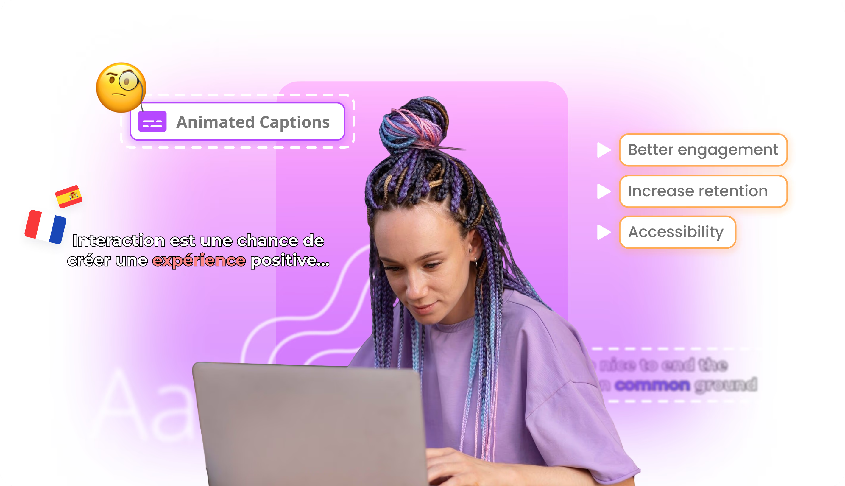
Braiv treats caption design as a brand system, not a per-video setting. Set fonts, colors, position, and animation once — including active-word coloring for karaoke motion — and that style follows every short, clip, and full-length video you generate.
The practical difference is where design time goes. Instead of restyling each export (and each language), your team locks the look once and reviews exceptions. Creator-energetic and corporate-restrained modes live in the same controls, so social and B2B libraries do not need separate tools.
Keeping brand intact after localization
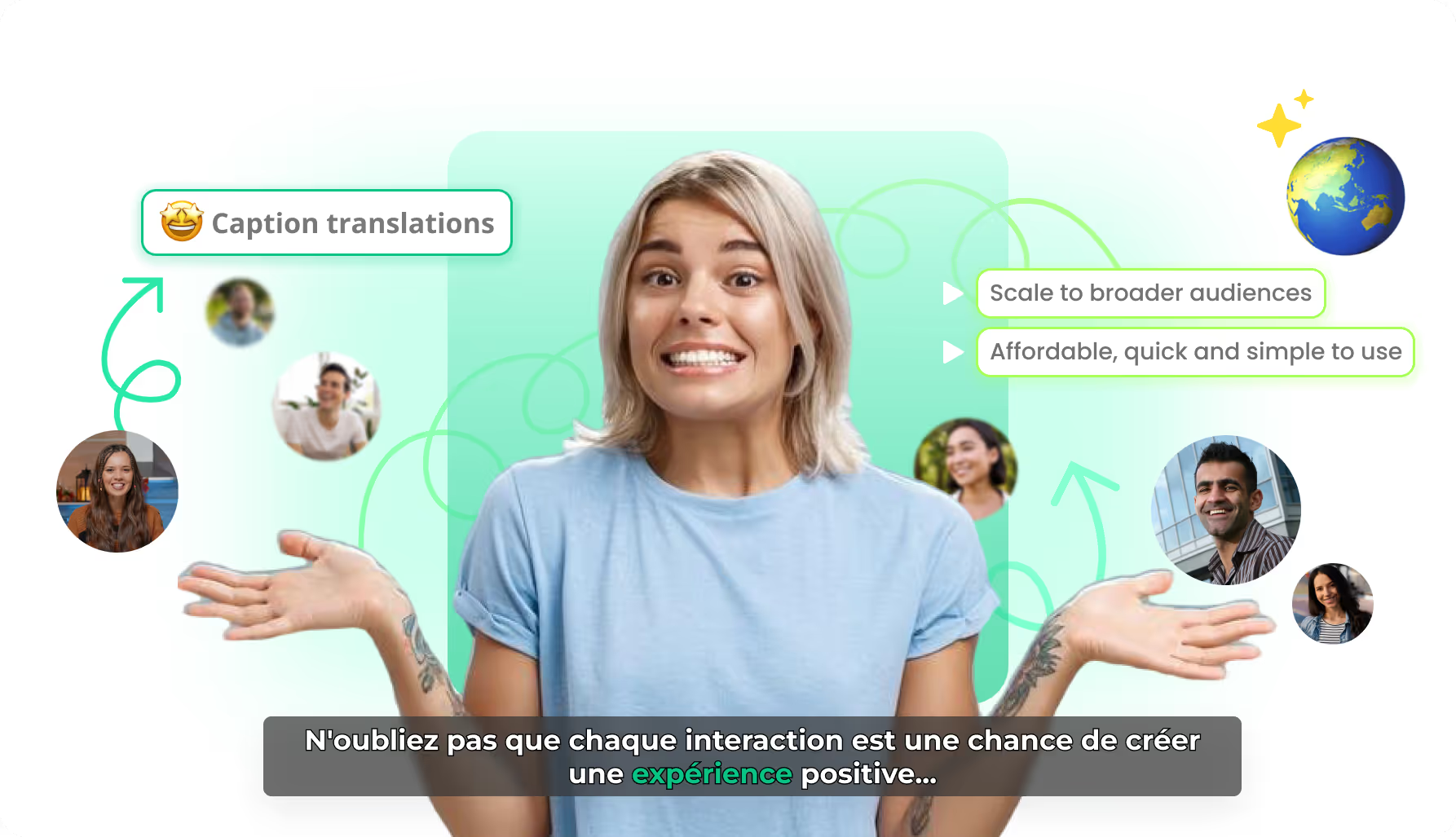
Translation often resets styling: a Spanish burn-in arrives in a different font, or the active-word color disappears. Braiv preserves timing and motion while translating captions, so the localized cut keeps the same brand system as the original.
That matters when one webinar feeds English, Spanish, and German channels. The words change; the caption brand does not — which is how a multi-market batch still looks like one company.
Where this sits in Braiv Captions
This is the brand-control attribute inside Braiv Captions. The same product also covers word-by-word animated captions and AI caption translation. Caption generation and localization draw on the shared AI Credit balance — full plan detail on pricing.